QB Simulation
2022 SPD Gold Medal Nominee
•
2022 SPD Gold Medal Nominee •
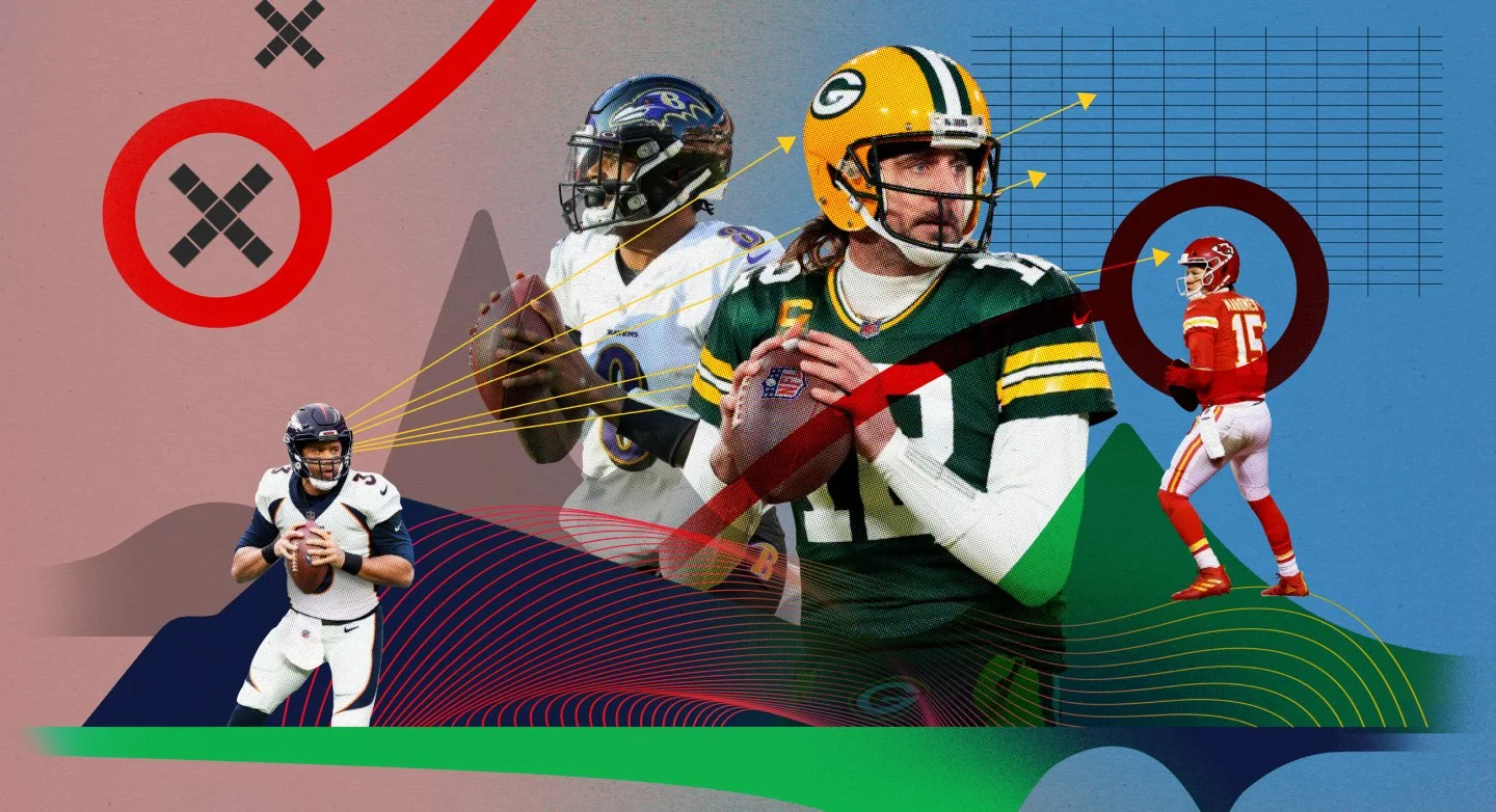
Illustrations by Brian Stauffer
We teamed with ESPN fantasy guru Mike Clay to simulate quarterback performances in all 272 games of the 2022 season. We also gave fantasy tips for all 18 weeks, concluding with the top performers of the season.
My role as Senior Designer was to concept, wireframe, and design the page for mobile and desktop, as well as manage the freelance illustrator and assist in preparing assets for various platforms.
The Problem(s)
How do we limit scrolling so that users make it through the entire experience?
How do we make a data-heavy piece visually interesting?
How do we incorporate the popular ESPN fantasy football product?
Our Audience



Design Process
1 - Research
2 - Wireframe
3 - Design
4 - Takeaways
Research
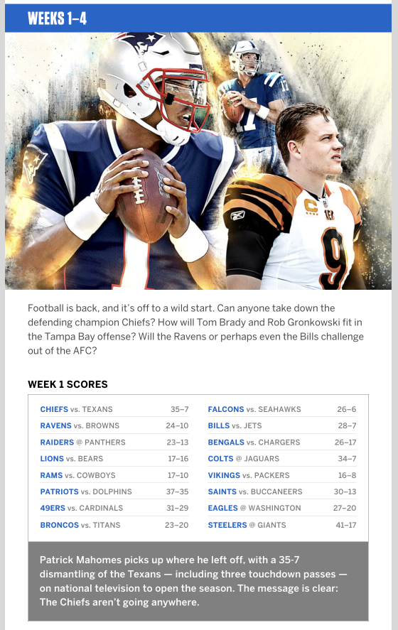
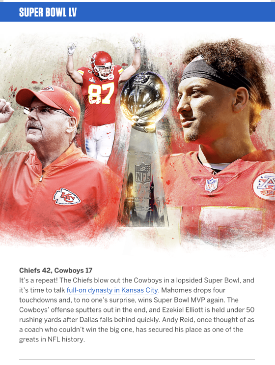
Since we were building on an existing product, we were able to take what we learned and concentrate on improving the user experience rather than building from the ground up. We wanted to focus on a more visual representation of the data and making it more dynamic and engaging.
Wireframing
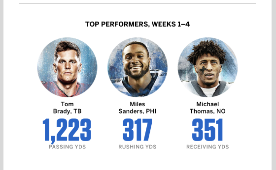
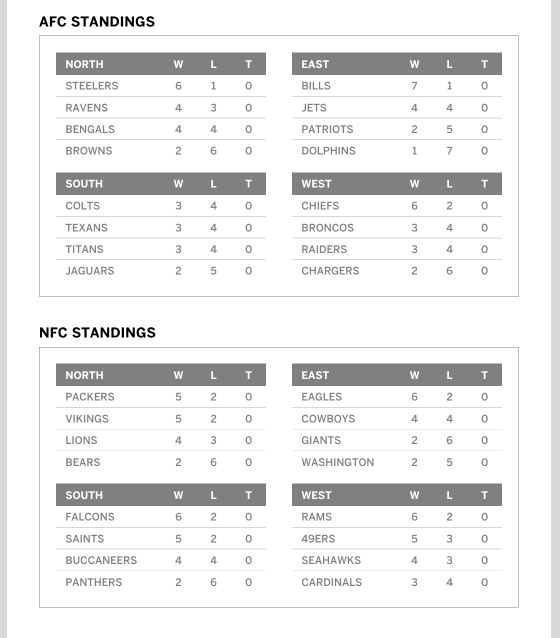
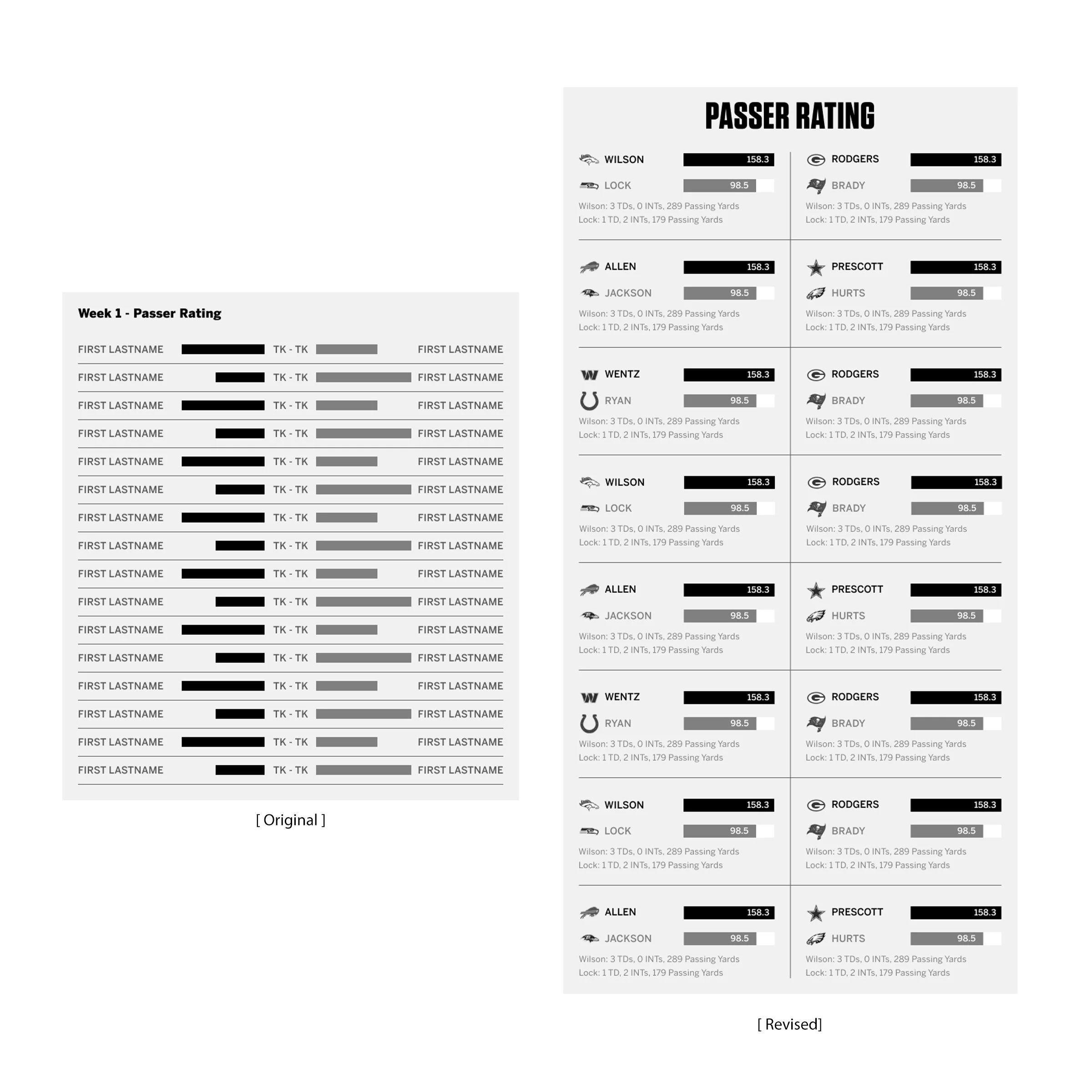
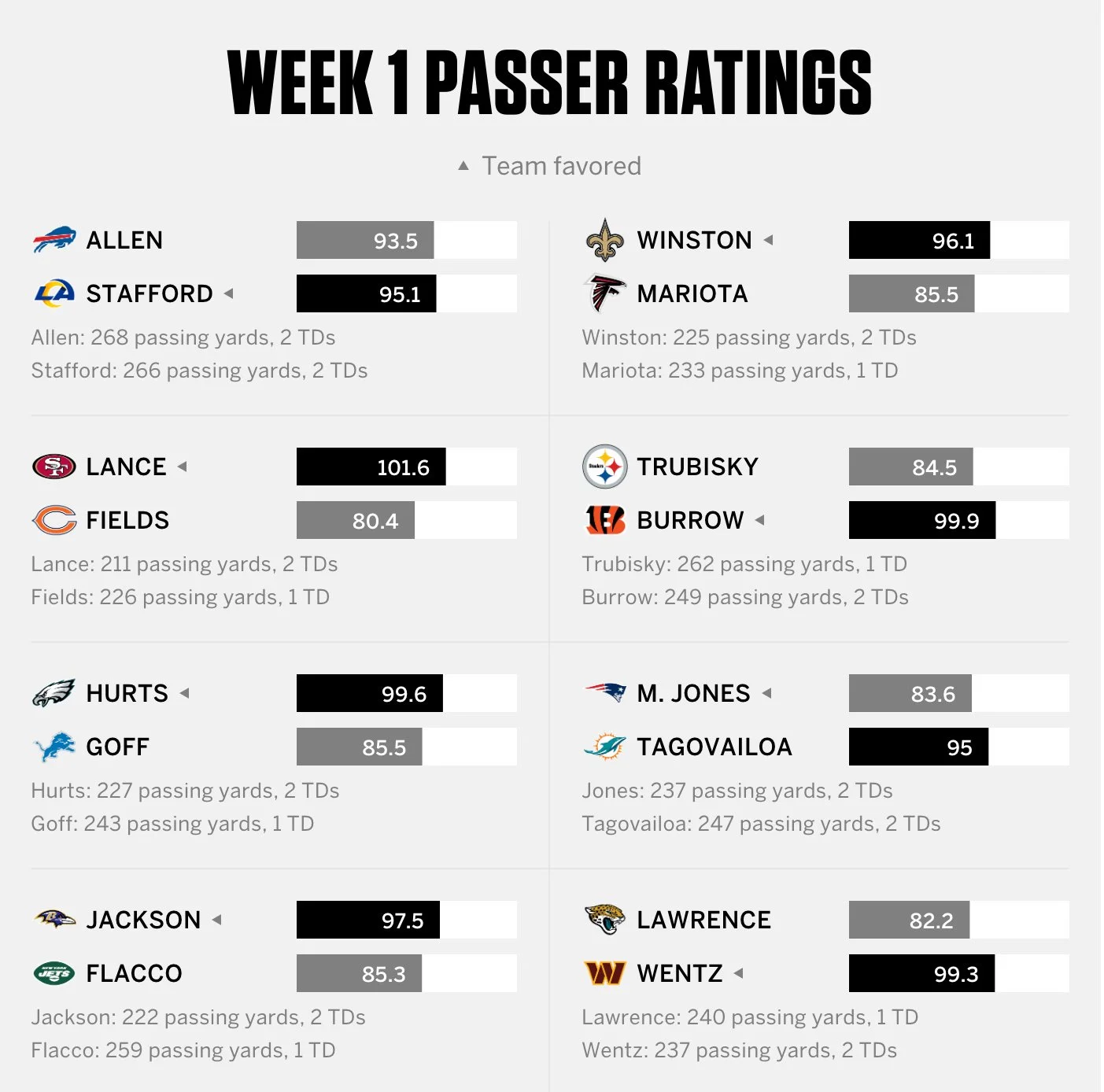
We identified which information needed to be displayed the most prominently and worked to develop multiple solutions. Early on we realized the story would be long and require a lot of scrolling, so we worked to condense information into a smaller footprint. Collapsable elements were considered but we ultimately decided the best experience would not require the user to break the scroll and interact with elements. Lastly, we wanted fans to be able to easily compare different QB performances. That meant bringing the bar graphs closer together for easy 1-to-1 comparisons and adding team logos for quicker recognition.
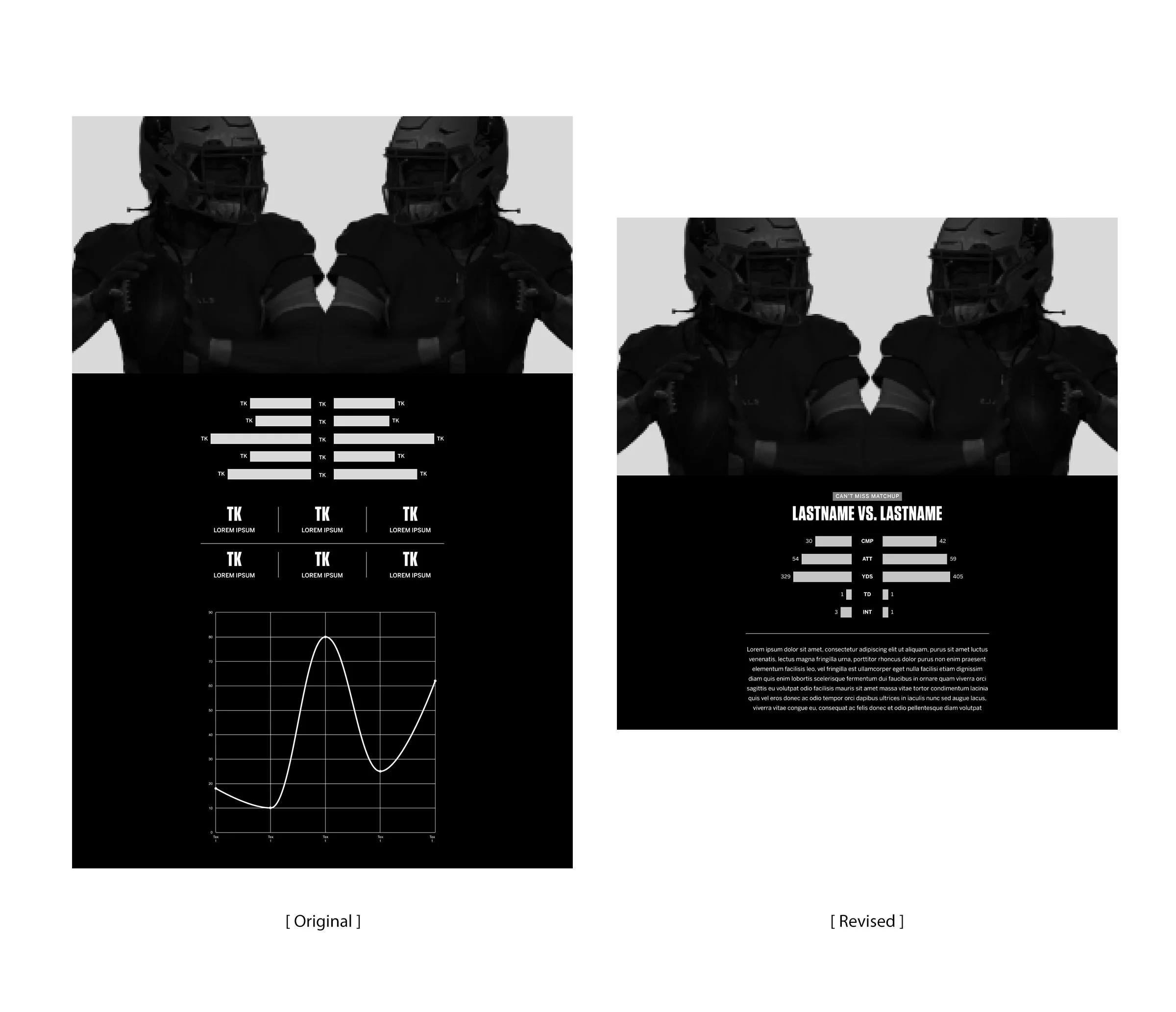
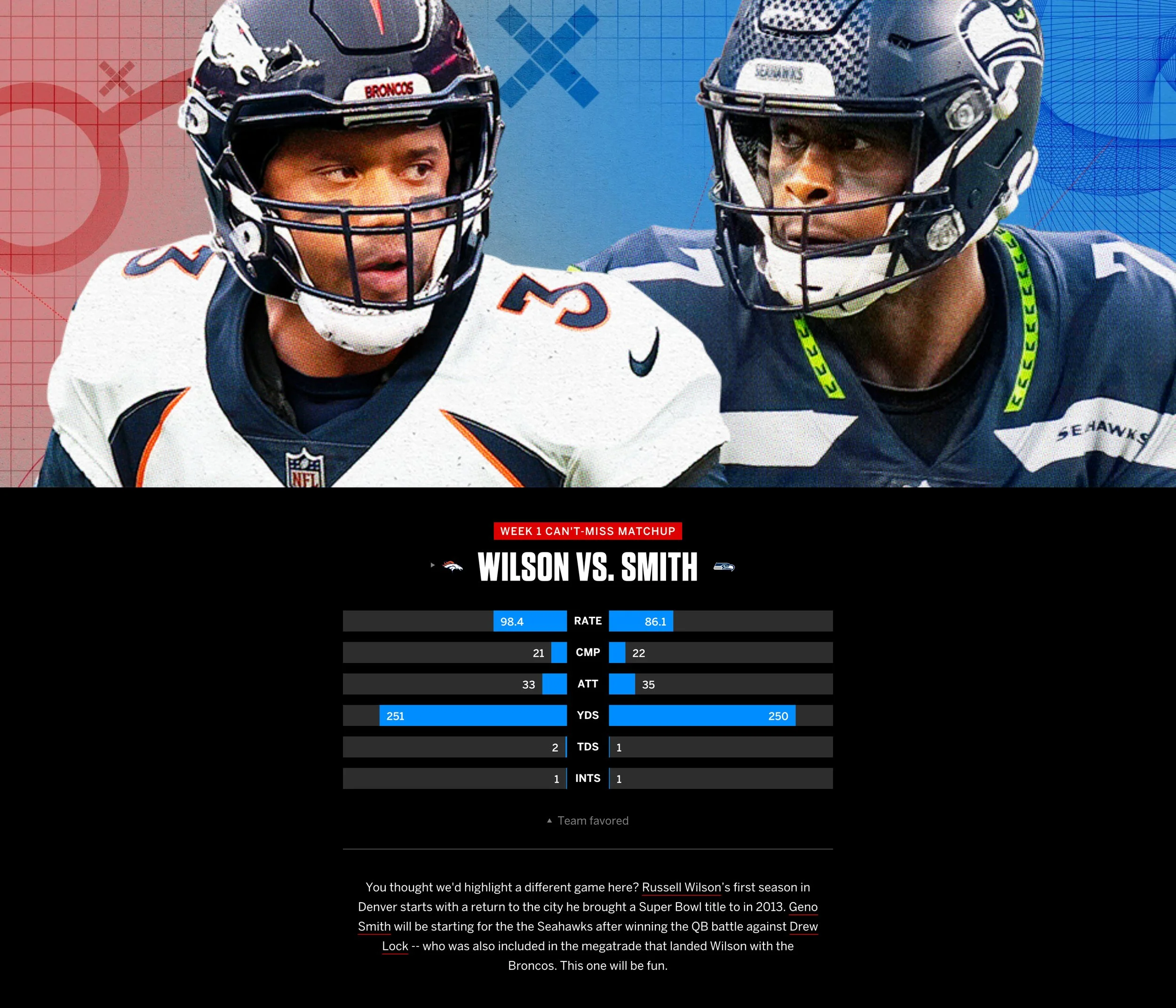
The large ‘Highlight matchups’ were the first thing our users would see and would showcase the biggest matchups of the week. This module would provide a more in-depth look at the quarterback’s performance and provide a visual upgrade to the 2020 project. The original version included a lot of data-viz elements but we determined it was too long for an already lengthy experience, so we removed the chart and table and condensed the module. The simpler design made it easier to digest the information and gave us space to add insights from our fantasy expert.

We added a ‘Fantasy Tip’ module to further capitalize on the fantasy brand
Design
We had two goals with the design; use large, bold illustrations to draw in the fans, but be reserved with the data-visualization elements for easier consumption of the information.
We partnered with Brian Stauffer, an award winning illustrator that has worked with some of the world’s best publications, to help elevate the experience with eye-popping visuals.
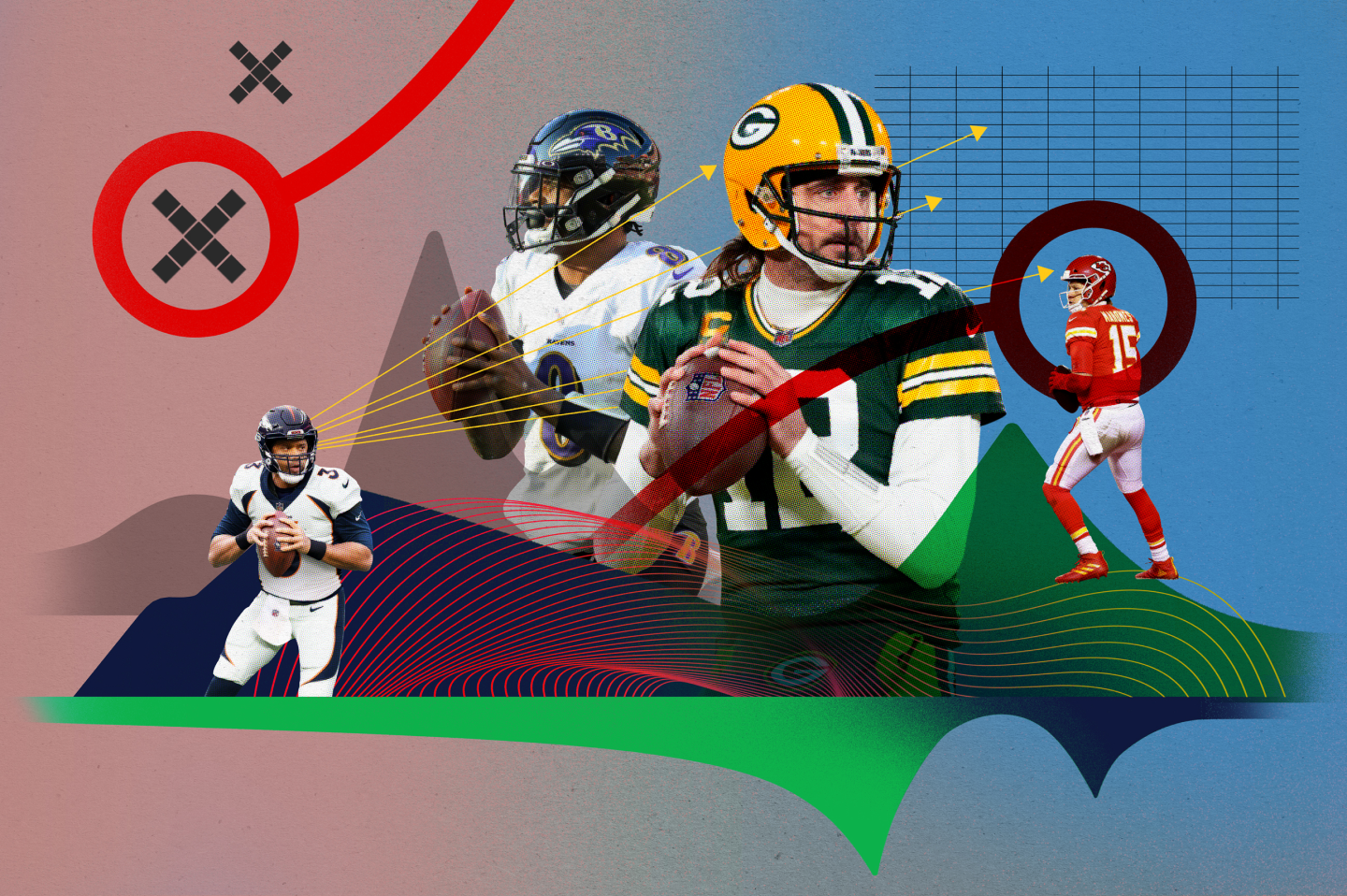
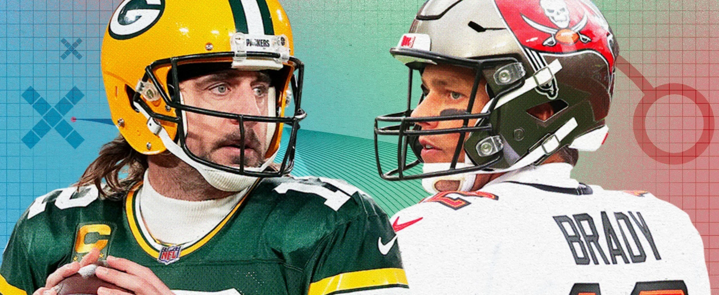
We paired Brian’s illustrations with a more in-depth look at the week’s best matchup. The art combined with the animation our developers implemented was an impactful introduction and kept users engaged through the entire experience.
No one could have predicted how these two seasons ended.
As for the rest of the data visualization elements, we kept them simple using a limited color palette with the team logos adding some visual interest. The contrast of the horizontal bar charts made for a quick read and comparison of the two quarterbacks.
Takeaways
Our analytics showed that users weren’t making it through the entire experience. Average engaged time was less than typical and was likely due to the length of the story. We were aware of the length and consciously tried to shorten it, but without time to user test on a larger audience, there is no way to know for sure ahead of launch how it will perform. We’ll use the data gathered here to help inform our decisions on future scrolling products.